CNQ Sport – A fresh new look
Branding • Logo Design
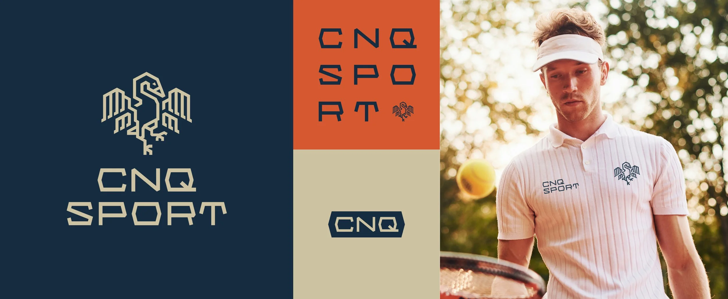
CNQ Sport is a tennis and padel retailer offering professional gear, racquets, shoes, and everything players need to perform on court. In 2021, I refreshed CNQ Sport's brand identity to better reflect the quality of the products they sell and strengthen their position in the market.
The Challenge
The client felt the old look was outdated, lacked cohesion, and didn't communicate the high quality and luxury they wanted the brand to represent.
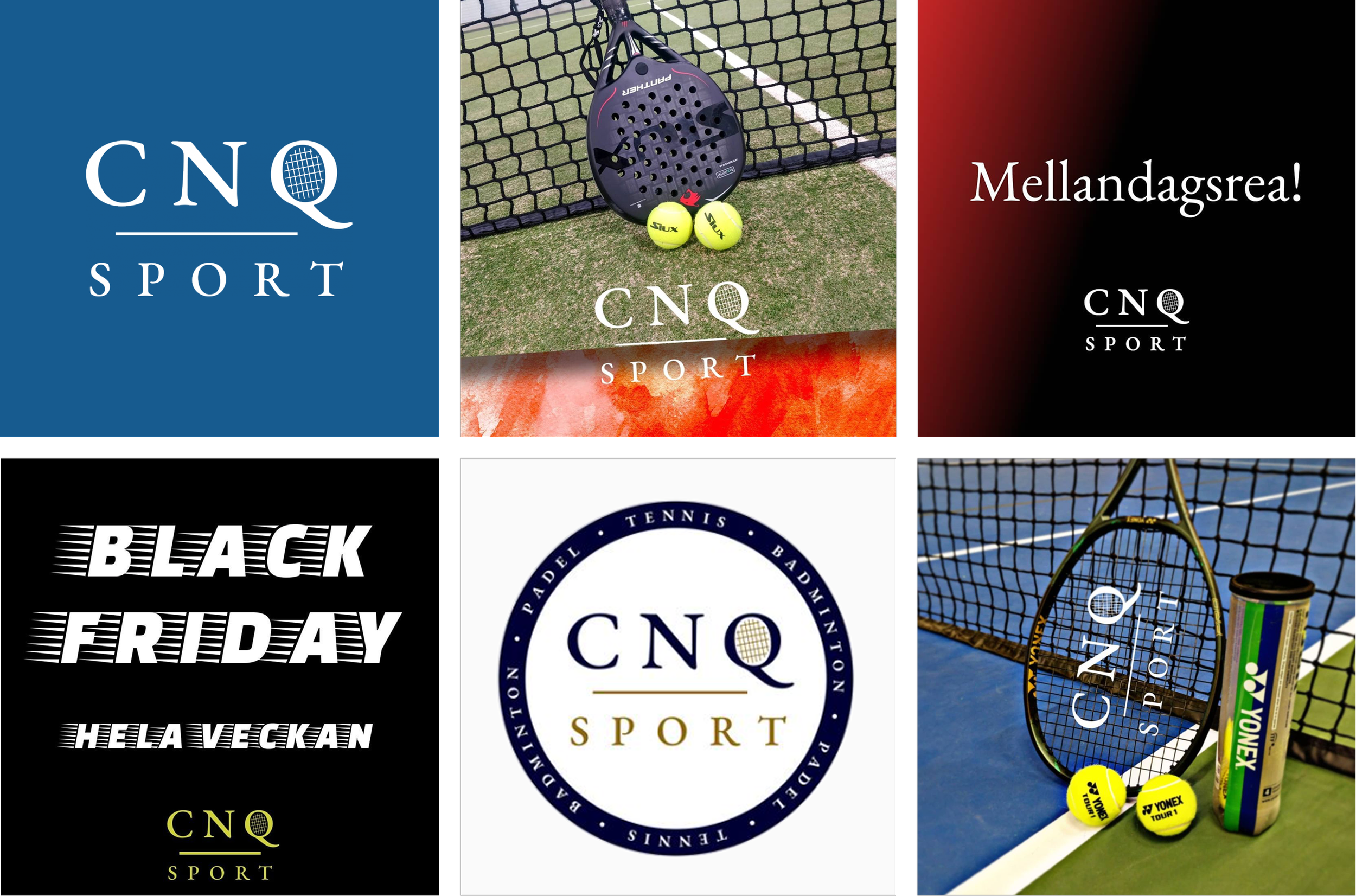
Sample of old look.
My Process
Together with the client, we landed on four key words to represent the brand: luxurious, high quality, sporty, and recognizable. I based the refreshed brand around these four words, using them as the standard every design decision had to meet, from color and typography down to the wordmark itself, which draws its shape from the geometry of a tennis court.
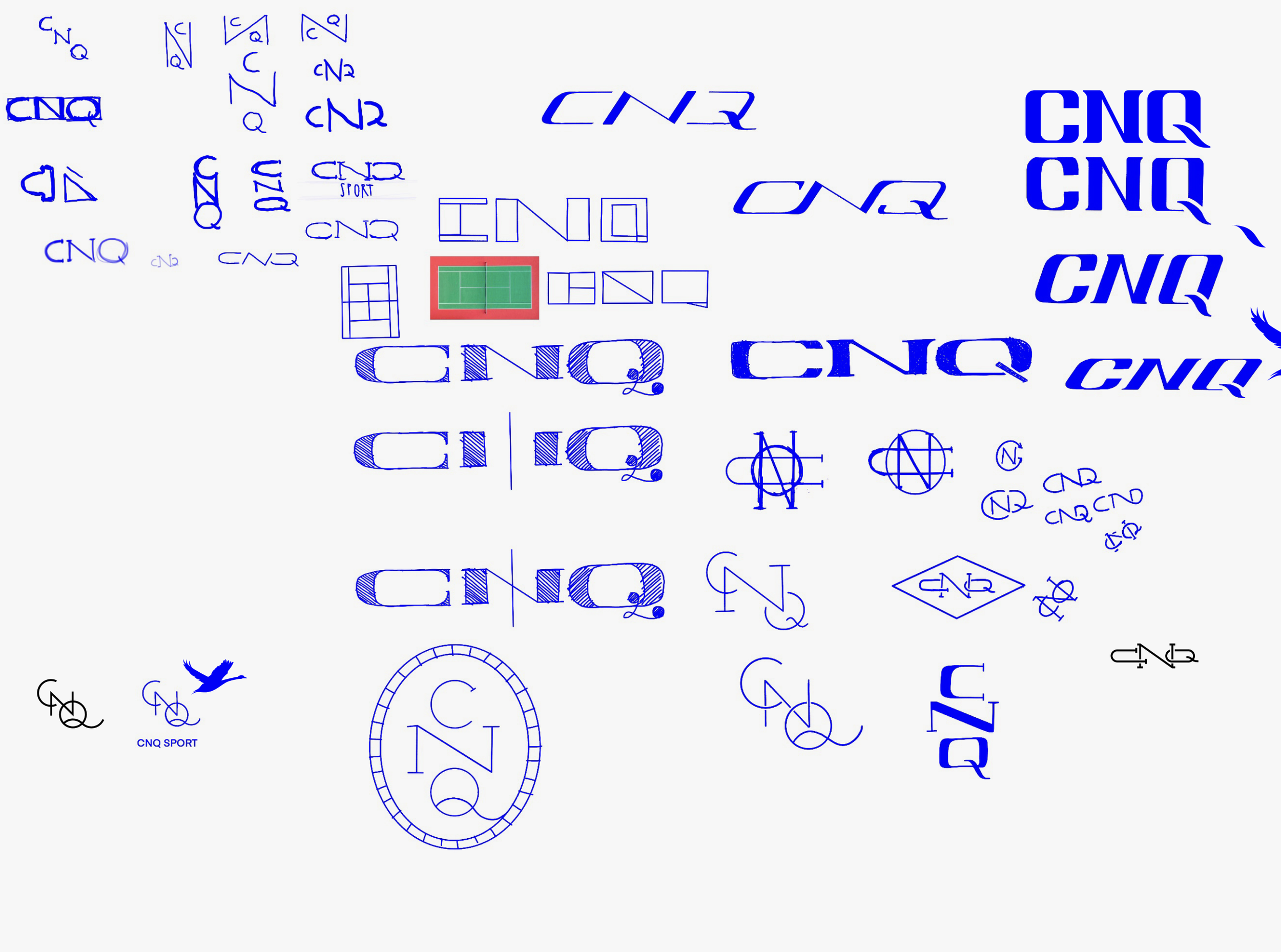
Some early sketches and exploration.
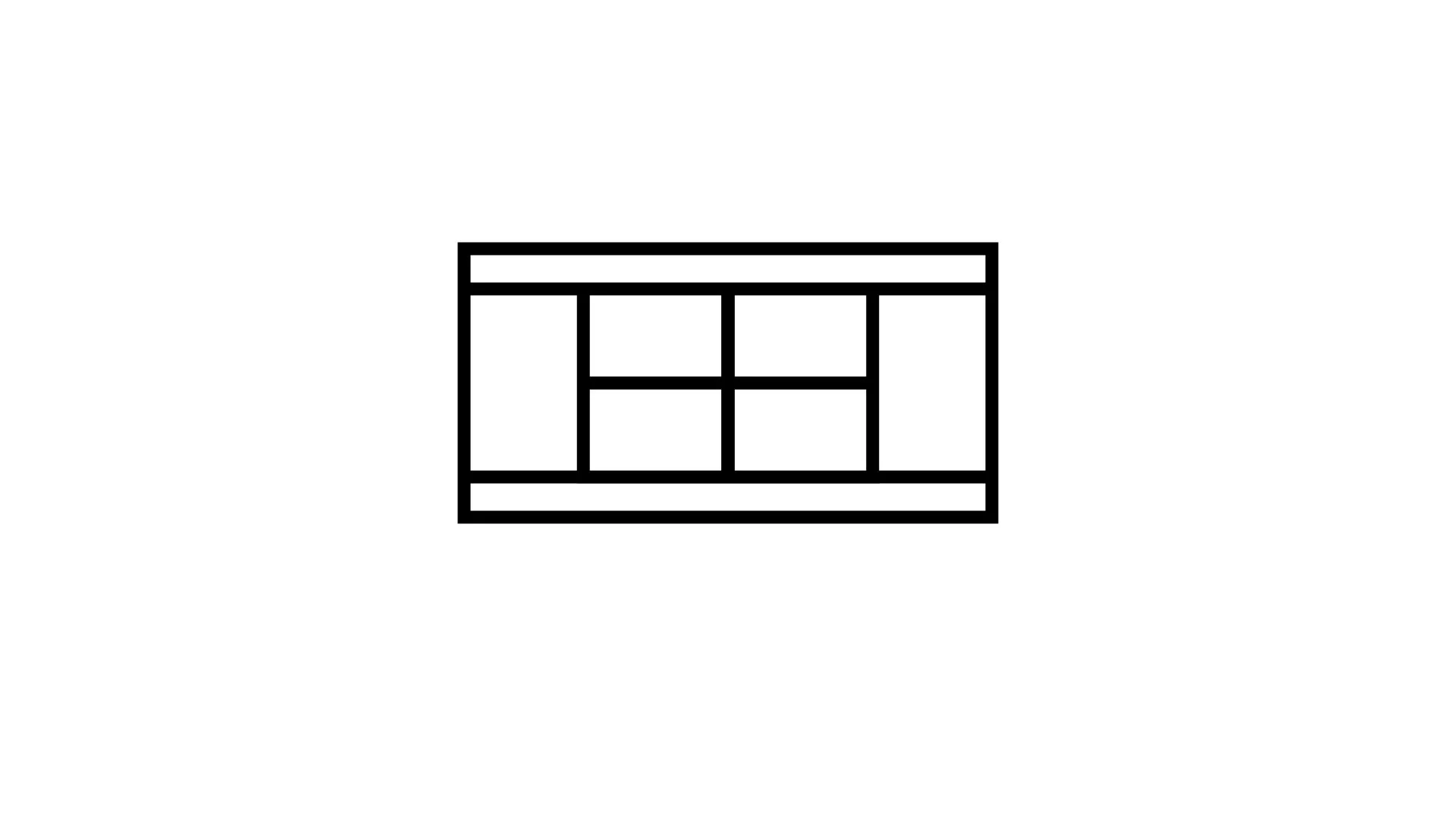

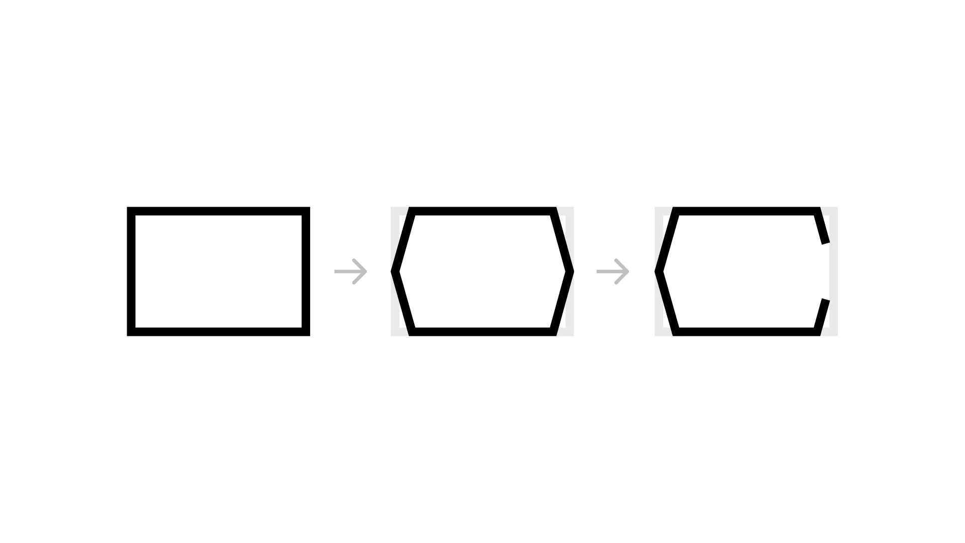
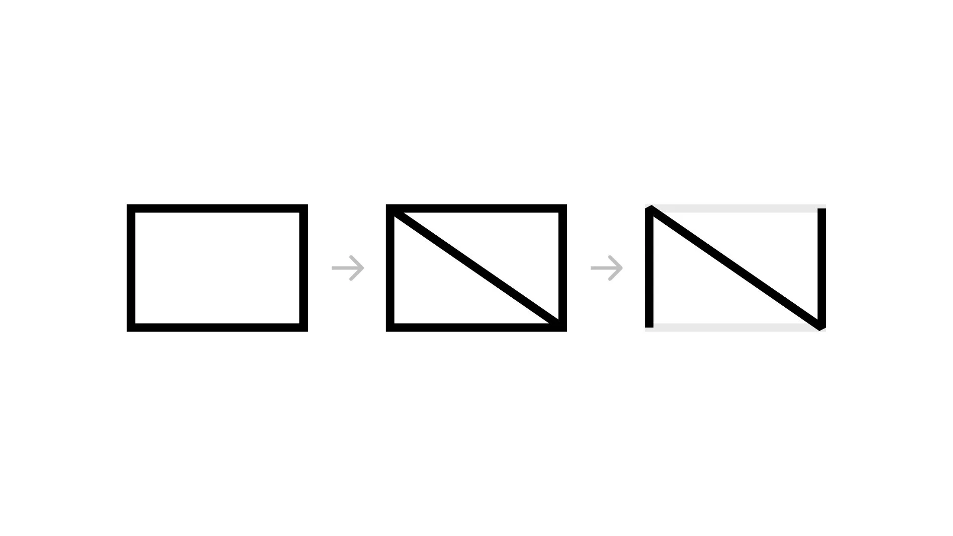
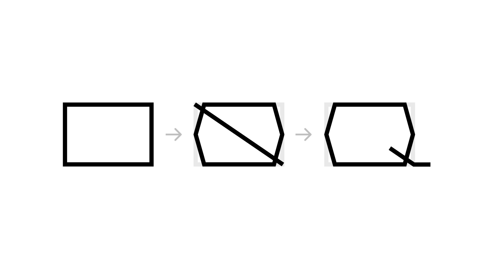
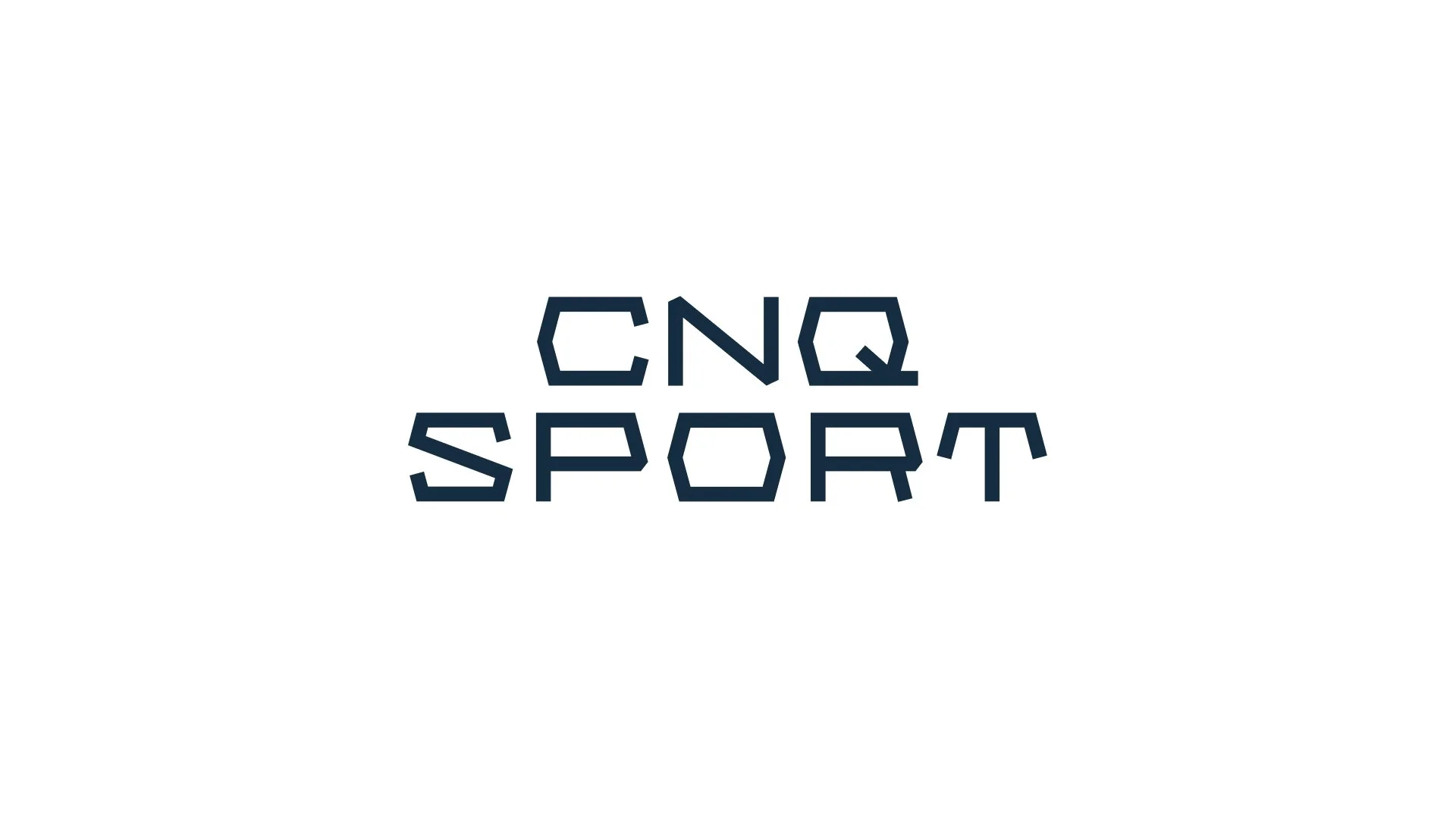
The idea behind the word mark draws its shape from the geometry of a tennis court.
The Logo Mark
The logo mark is a swan, chosen for what it represents: elegance, gracefulness, strength, dedication, and energy, qualities that map directly onto the brand's four key words. The swan roughly follows the same angles as the wordmark, creating a cohesive mark where the two elements feel like part of the same system rather than two separate pieces stitched together.
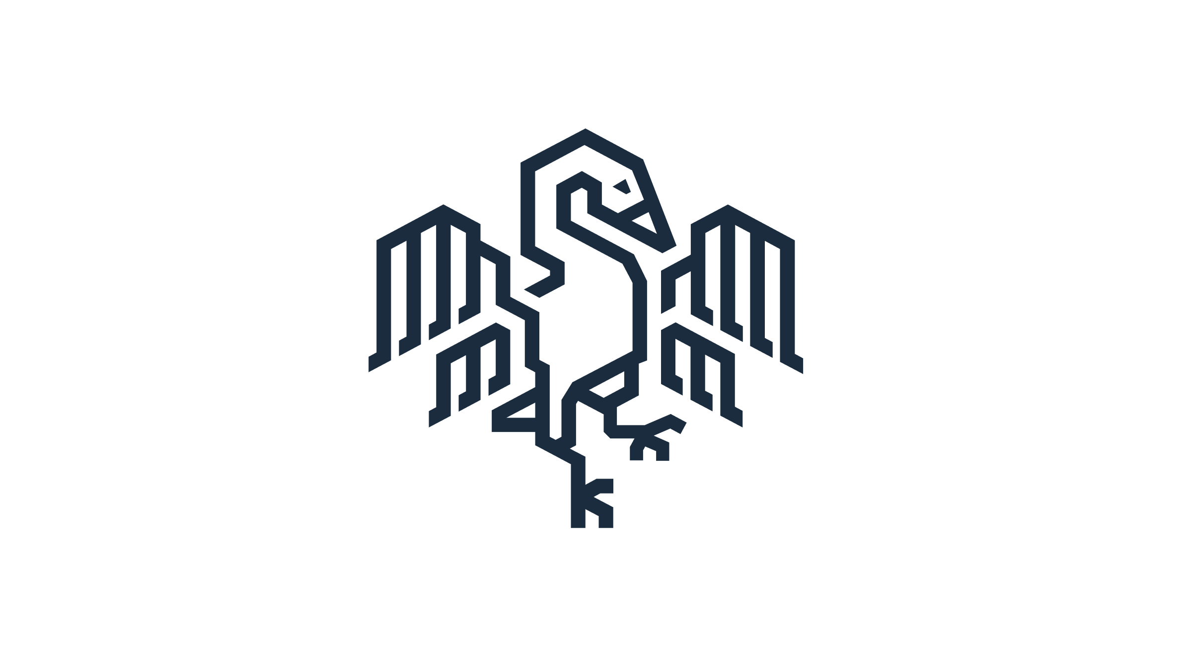
The logo mark – the swan – signals elegance, gracefulness, strength, dedication, and energy.
The Color Palette
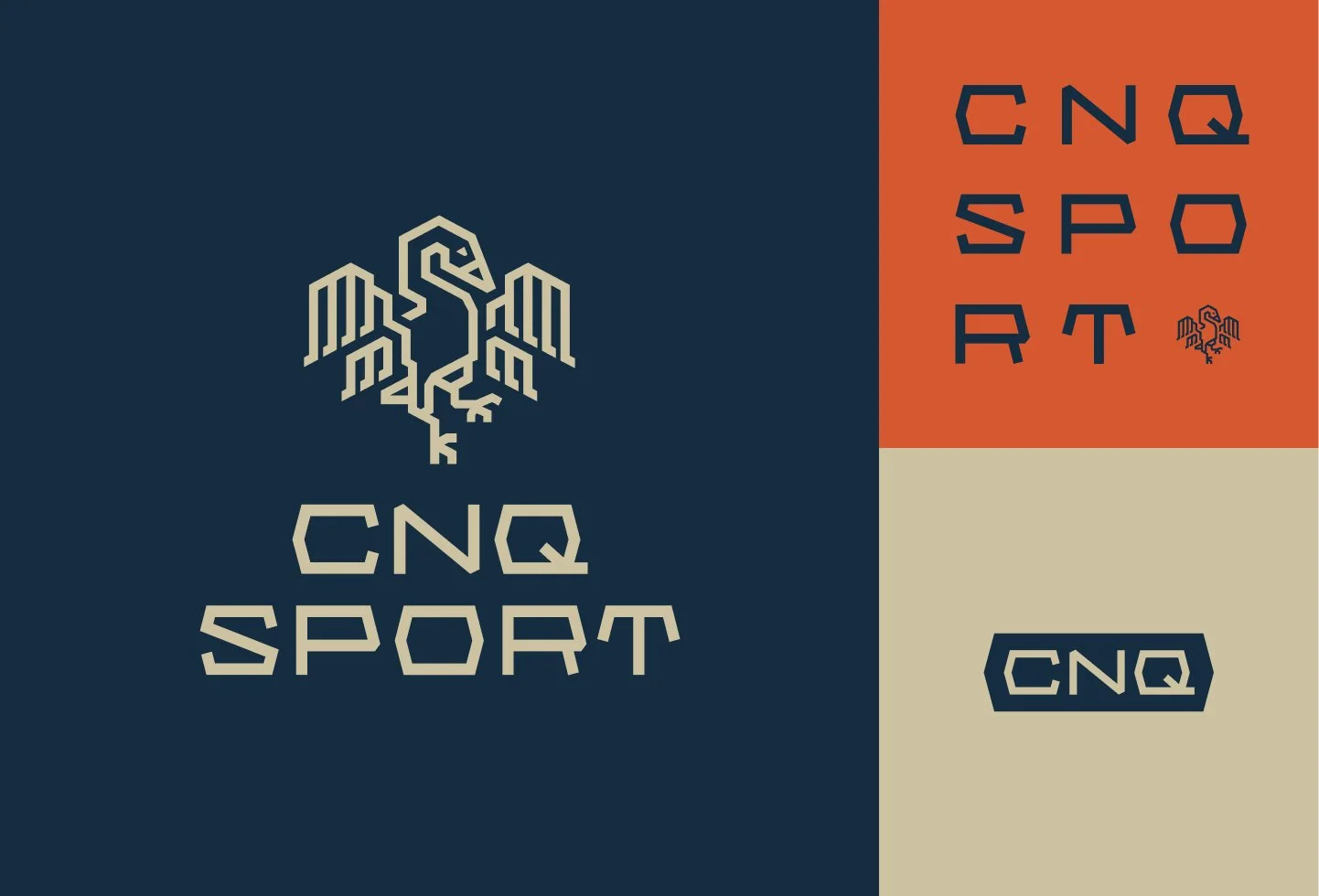
The palette is built on dark navy blue, orange, and gold, each one tied directly back to the brand's key words. Navy forms the solid base, signaling trust, professionalism, and experience. Orange draws on the clay courts tennis is played on, bringing in the brand's sporty energy. Gold does the most obvious job of the three, standing in for the luxury the brand set out to communicate from the start.
The Result
The result is a logo and brand identity that's unmistakably tied to the sport it represents, distinctive, purposeful, and built to reflect the quality of the products it stands for.
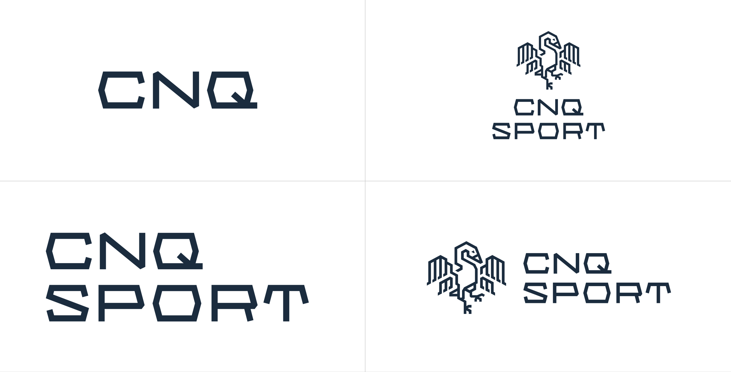
The logo in different lock ups.
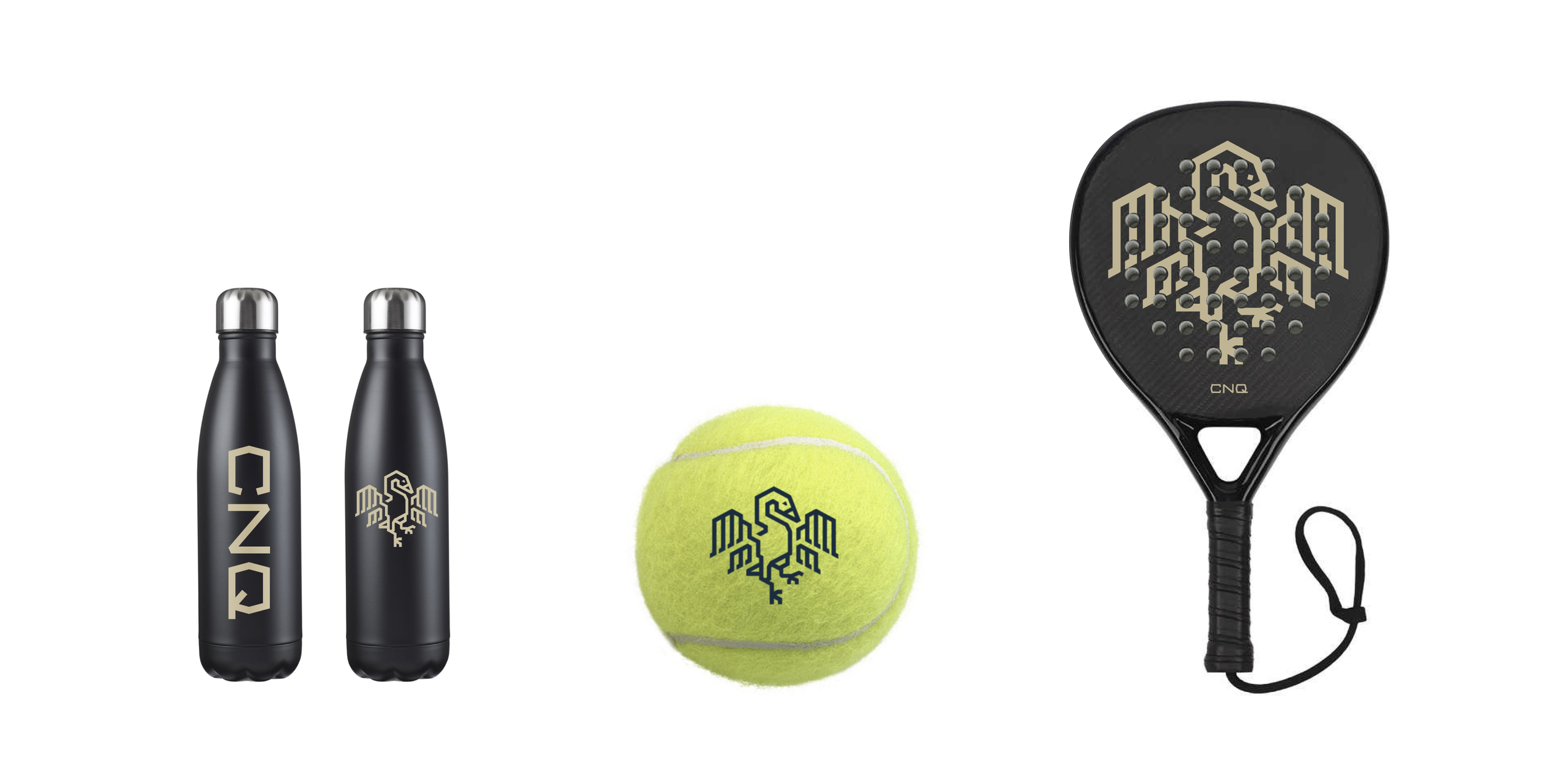
Branding attached to products.
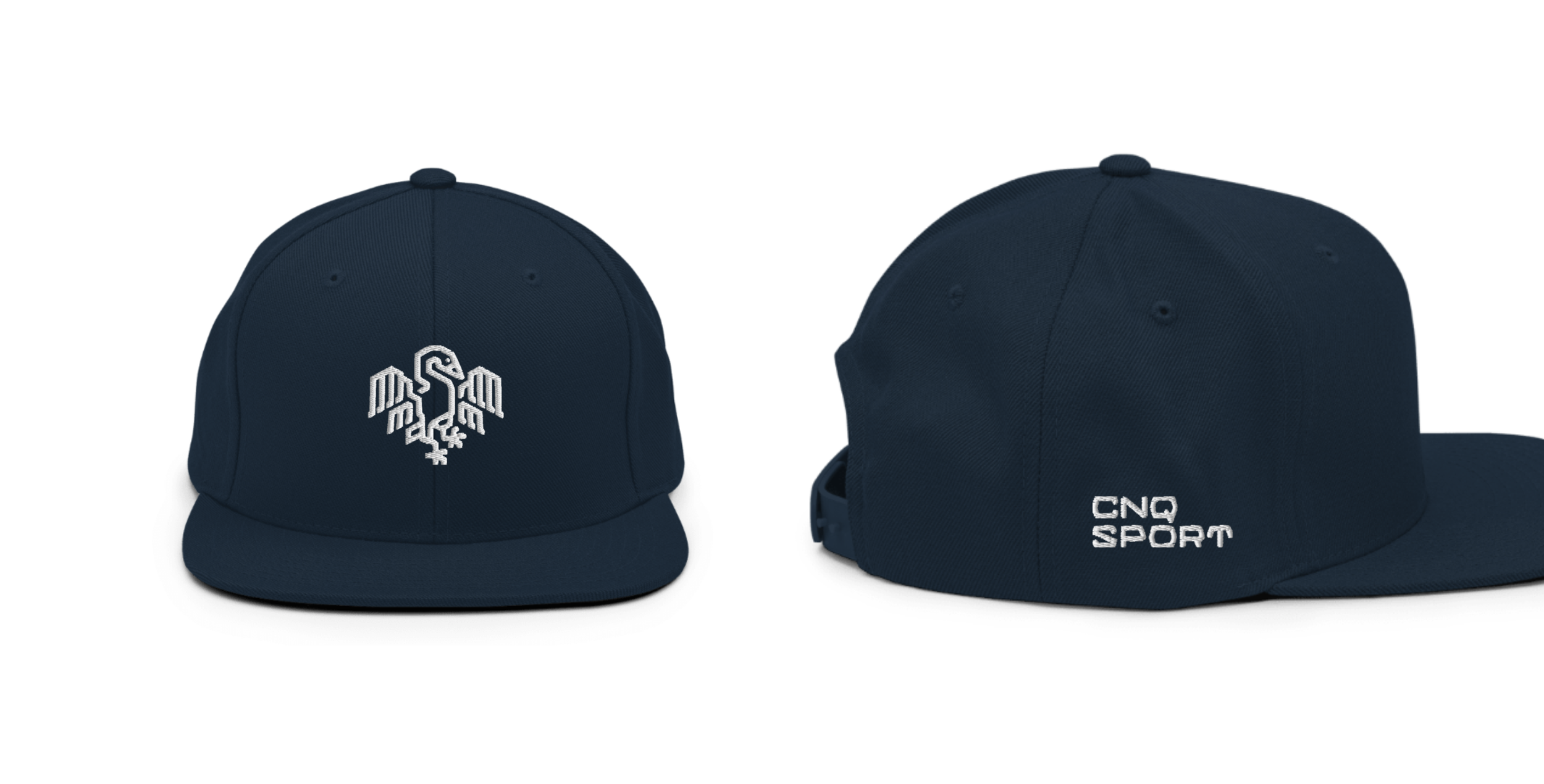
Embroidered cap with the logo on the front and the word mark on the side.
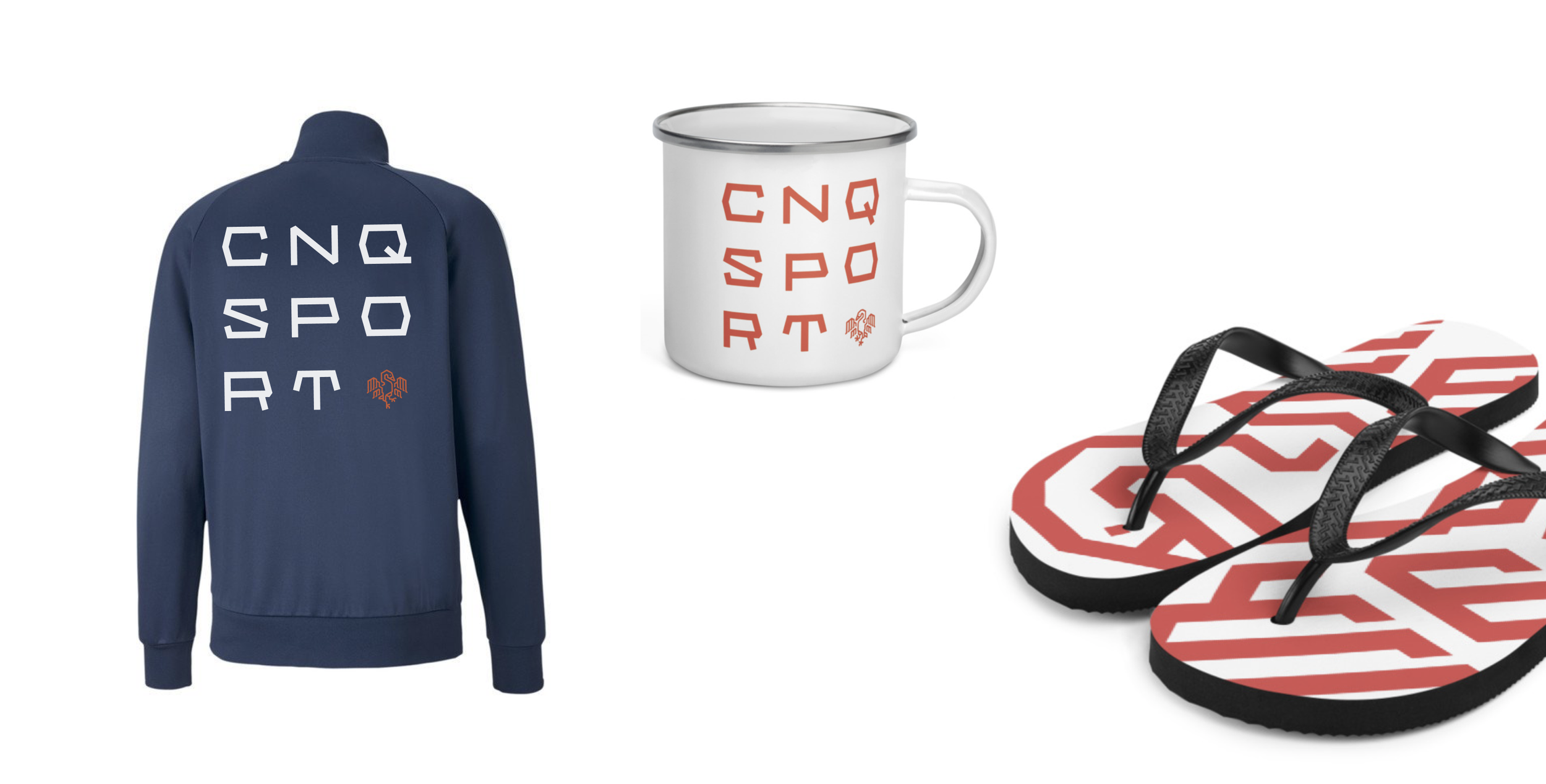
Example of alternative logo on apparel.
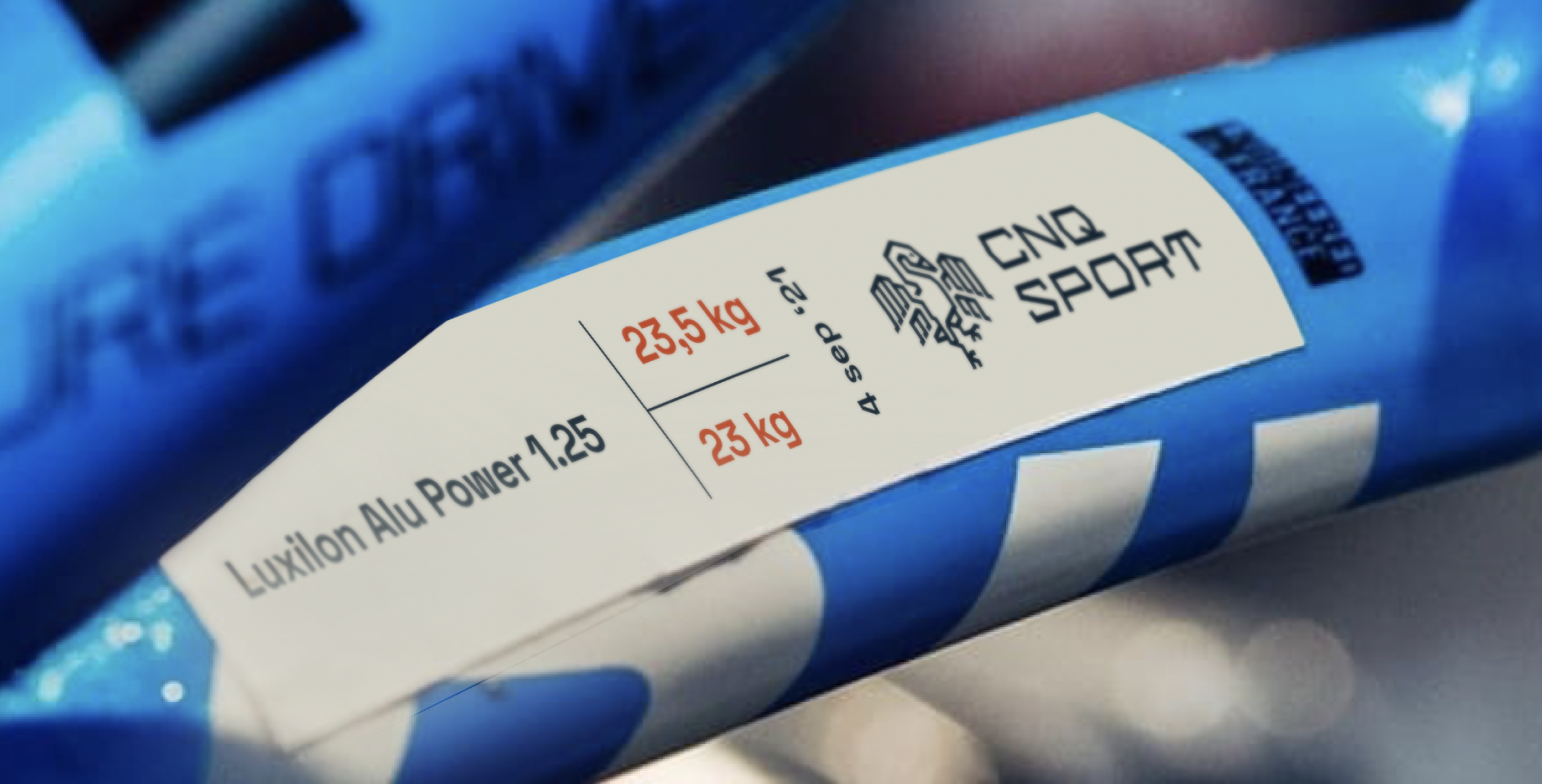
The logo on the sticker placed on a racquet after changing its strings.
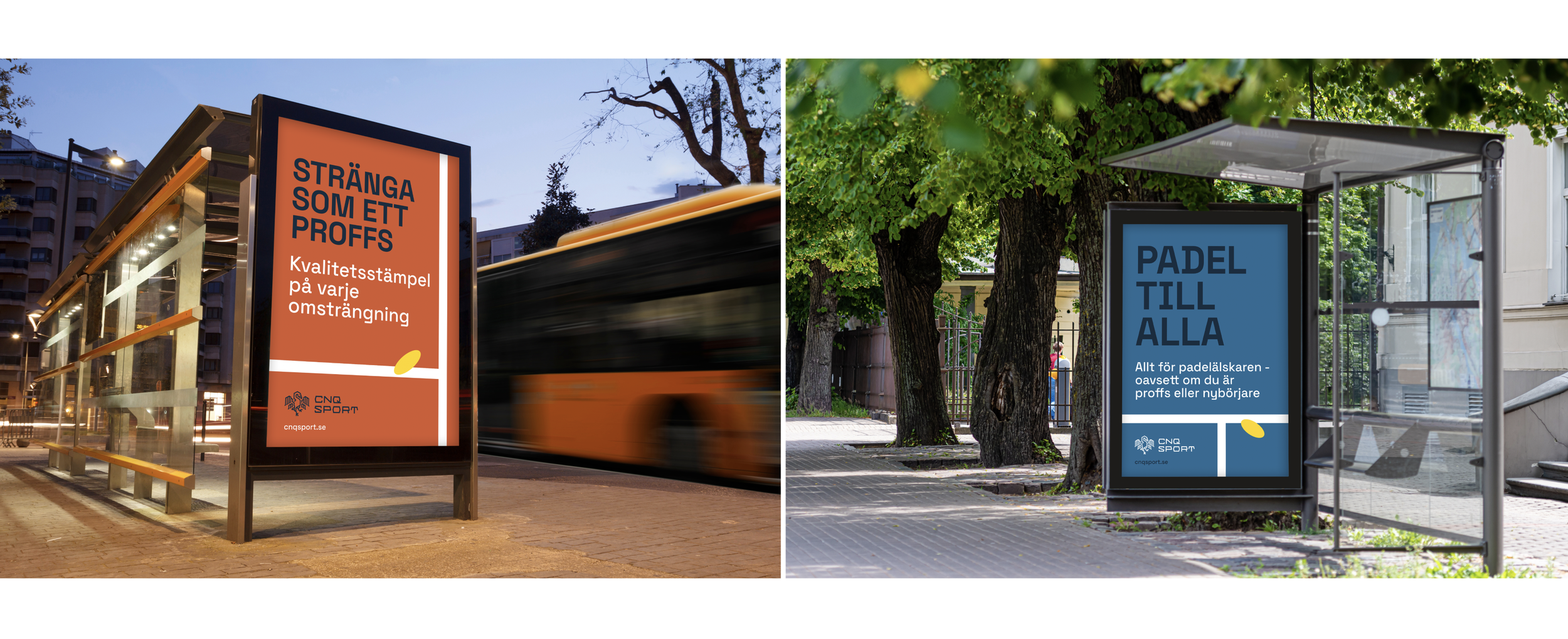
Example of advertisements on bus stops.